Page 1 of 2
The Kitchen

Posted:
14 Apr 2013, 20:31by Suff
Re: The Kitchen

Posted:
14 Apr 2013, 21:45by Kaz
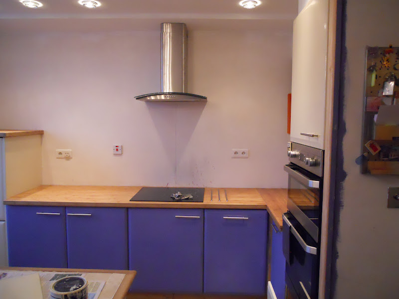
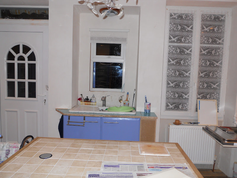
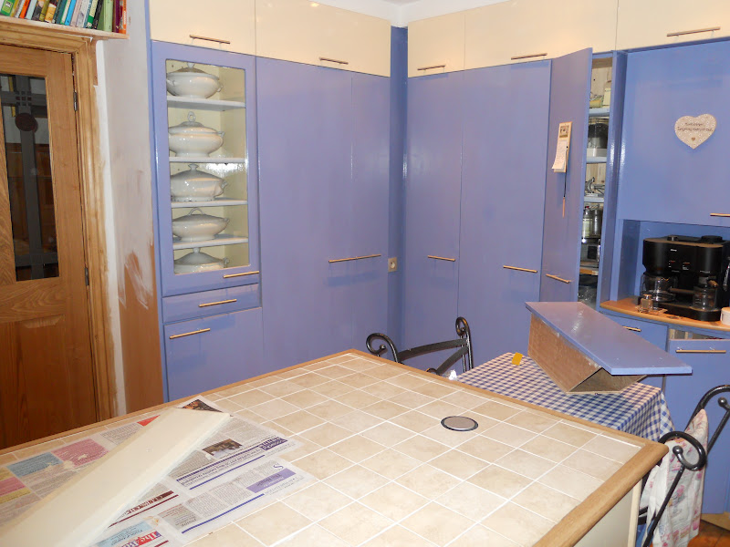
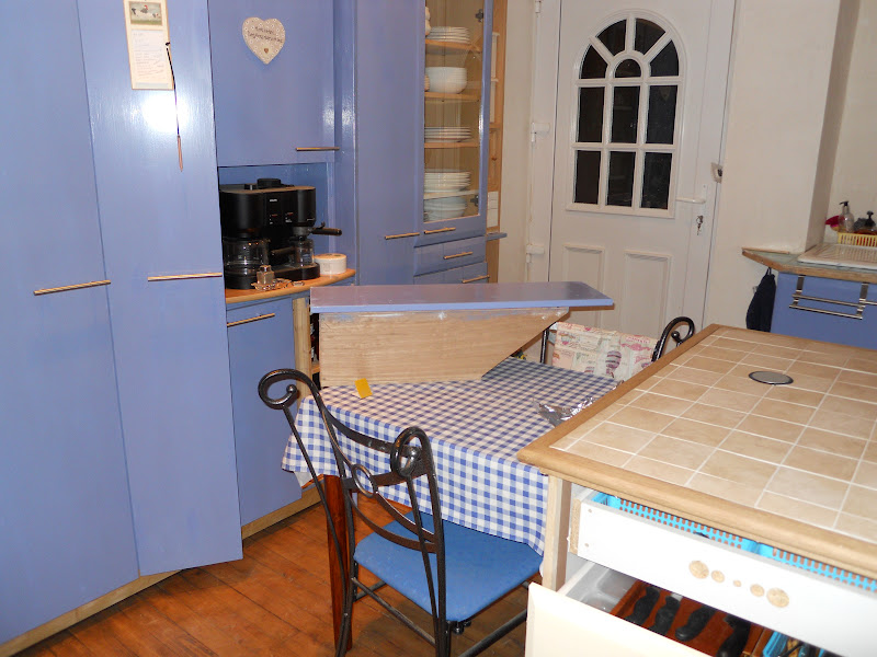
I like the blue door fronts


Re: The Kitchen

Posted:
14 Apr 2013, 22:12by Suff
Mrs S' choice. She built them and painted them....
Talented lady.
Re: The Kitchen

Posted:
14 Apr 2013, 22:15by debih
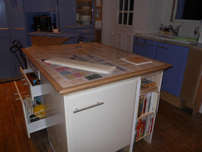
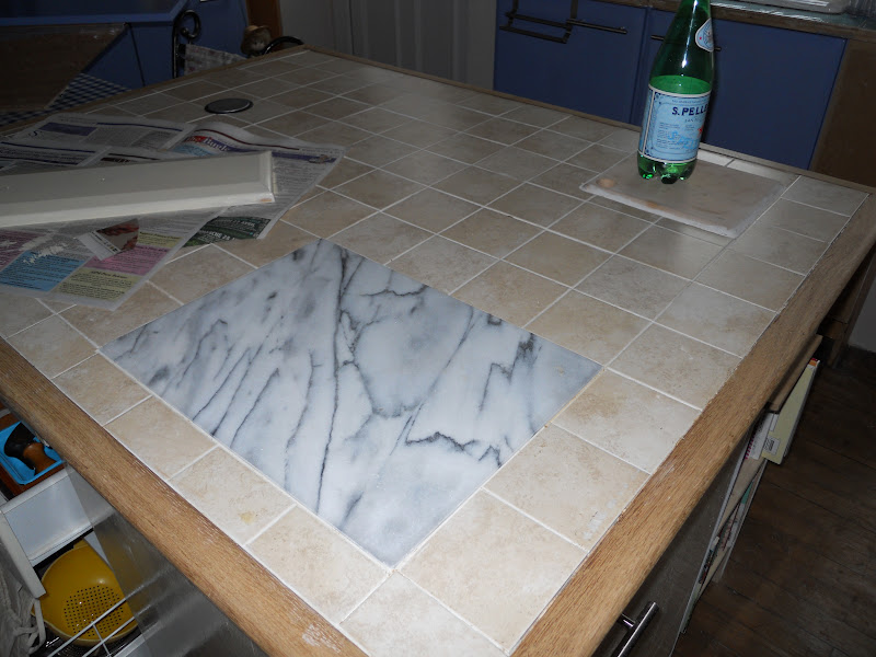
I love the colours Suff and I especially love the marble inset in the island.
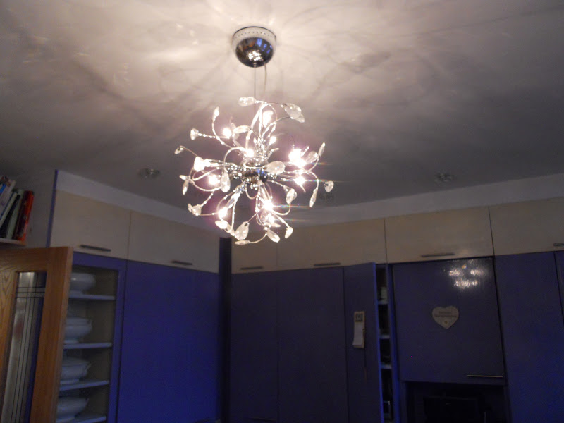
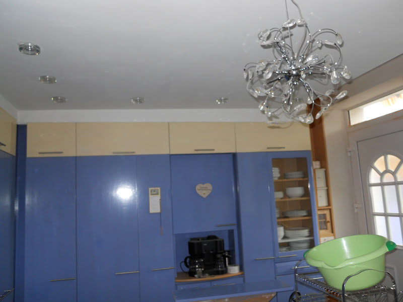
But that light - OMG. Now that is to die for. I have been wondering what sort of thing to get for my dining room and I think I may just have found it! Just need to persuade Mick now.
Re: The Kitchen

Posted:
14 Apr 2013, 22:42by Diflower
Suff that's looking
lovely, really pretty but practical too

And I do agree with Debih about that light

Re: The Kitchen

Posted:
14 Apr 2013, 23:02by JoM
Really love that Suff...the colours, the style...everything! That light is amazing!

Re: The Kitchen

Posted:
14 Apr 2013, 23:07by JoM
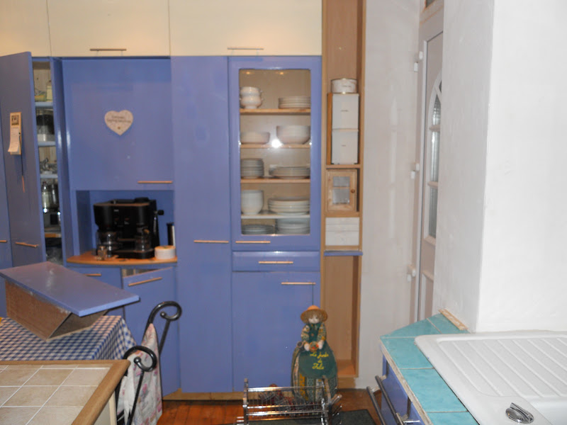
I'm looking through your picture folder, the floor is lovely and I'm amazed by the storage unit on the wall to the left of the door in the picture where it's shown without it's doors. I love how everything can be seen so easily! Such a practical kitchen.
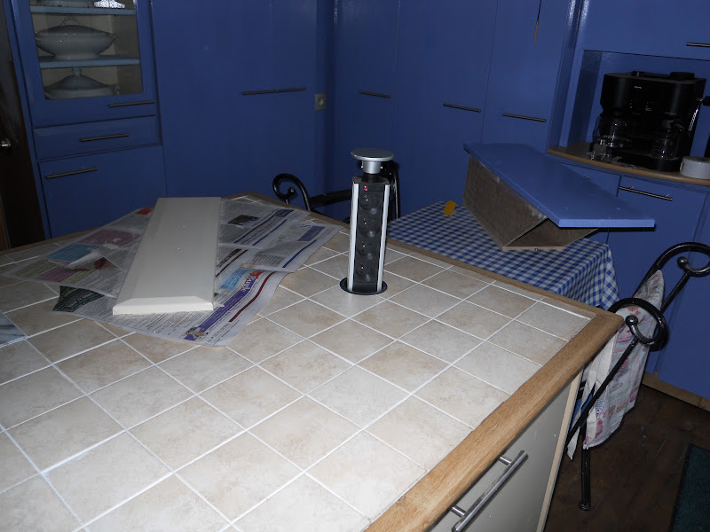
What is the black cylindrical object which looks like it lifts out of the island?
Re: The Kitchen

Posted:
14 Apr 2013, 23:24by Suff
The light is B&Q from Castorama in France.
I have to admit the majority of the ideas and style for the kitchen are from Mrs S.
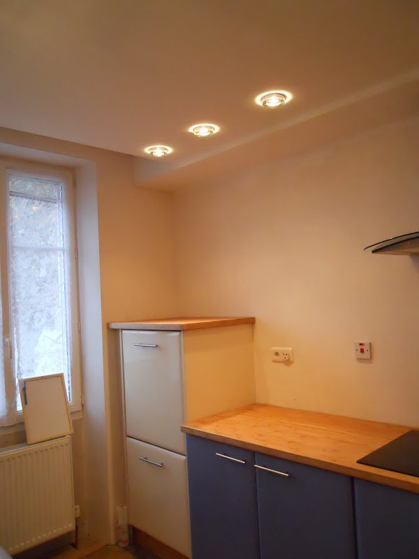
The ceiling has been dropped nearly a foot and all the wiring has been hidden for all the lights. The three zones (central and sink, Worksurfaces and cupboards), are all new.
It is the 3rd remake but it's the best.
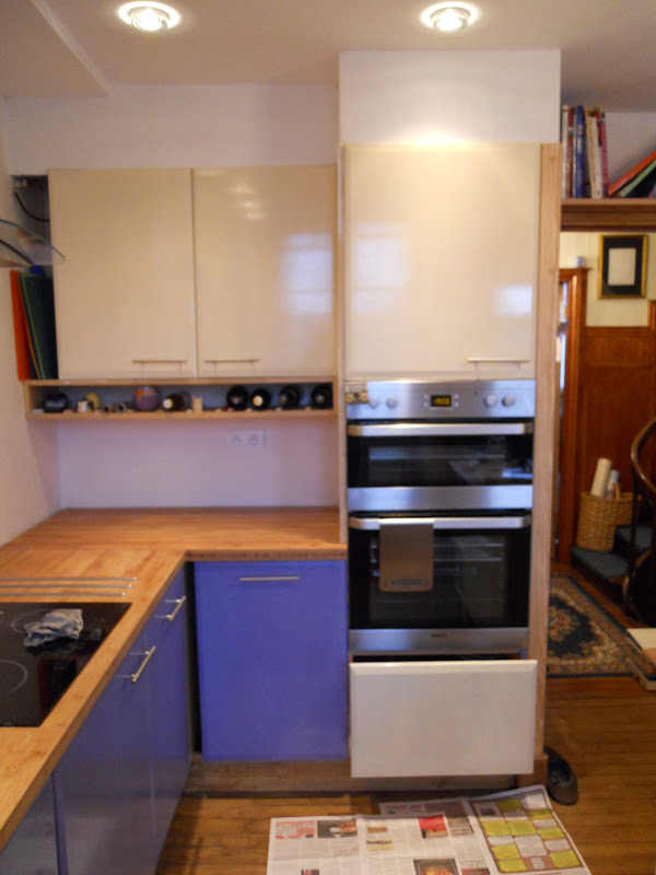
The oven housing was a real disaster. I made it. The cupboard over the top of it is an addition and houses the microwave. Mrs S brought the new cooker and dishwasher back before Christmas. I came home and went to build the housing for the cooker, only to find the manufacturer had mislabelled the oven and we only had a single, not a double. I had to measure the single oven then get the measurements for it off the web. Then I got the measurements for the double oven off the web and made the same extension to the calculations then made the housing. We got the oven on Christmas Eve at 4pm. Fortunately the oven fitted....
It's taken a while but I think it's worth it. The box with the blue front you can see on the island is actually a baguette bread box and belongs in the slot next to the back door. More of Mrs S' good ideas...
Re: The Kitchen

Posted:
14 Apr 2013, 23:38by Diflower
JoM wrote:What is the black cylindrical object which looks like it lifts out of the island?
I think it's sockets Jo - brill, isn't it

My ex inlaws had an island with something similar, even though it was a lot of yonks ago

Re: The Kitchen

Posted:
15 Apr 2013, 02:58by Weka
What an amazing difference! I love the light, I want one too. I wonder if the sell anything like it locally?
I really love how the kitchen is laid out. So practical looking, and love how the cupboards go to the ceiling.
How did mrs s paint them? Is it spray paint? The finish looks amazing, and yourve really to my brain thinking.....
